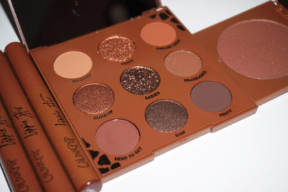
As a self-proclaimed ColourPop fanatic, of course I was going to buy this quad from one of my fav vloggers! You guys should know me well enough by now to know that I purchased this the second it released. This quad contained one matte finish eyeshadow, one satin, and two with a sheer opal finish, a new finish for ColourPop, that is similar to a duochrome finish from MAC or Kat Von D. What did I think? Keep reading!
While Dani has collaborated with ColourPop before on a lippie stix and pencil, this is her first eye shadow collab with the brand. The quad has a much deeper meaning than most of the collabs released by bloggers today. The name of the quad (‘Metamorphosis’) and the names of the individual shadows (‘Kindness’, ‘Hope’, ‘Strength’, ‘Bravery’) aren’t typical of eyeshadows currently on the market. Most of the time I expect a name like ‘Super Orgasm’ from NARS or ‘Sin’ or ‘Virgin’ from Urban Decay .. something a little raunchier than ‘Kindness’.
But the names made me curious about the naming process and production process in general, which led me to Dani’s explanation that she hoped these shadows would encourage consumers to ‘be the change’ they wanted to see in the world. To use the names of the shadow to spur a similar action from the user. Dani wants us to be strong in the face of adversity, be brave when venturing into the unknown, be kind to yourself and others, and hope that everyone else would do the same. Now if you watch Dani’s channel, this detailed though process shouldn’t come as a surprise. If you haven’t seen any of Dani’s videos, this is classic Coffee Break lingo.
Now on to the review of the individual shadows! I was most excited to try out the new sheer opal finish shadows. The swatches provided by ColourPop on their website made these colors out to be duochromes similar to the finish you would get from a MAC ‘Blue Brown’ pigment or a Kat Von D ‘On The Road’ Shape Shifting eye shadow. When I popped these open and finally stuck my finger in for a swatch, I could immediately tell that the product wasn’t as gelled together as the original formula satin finish shadows. The product immediately started flaking as soon as I swatched my finger across my arm. You can see in the picture how the swatch of ‘Kindness’ isn’t as clean as the swatch of Bravery or Strength. ‘Hope’ did a bit better, but the product was still much harder to control than the matte or satin finish colors.
Since sheer opal is a new finish for ColourPop, I don’t have any other shadows in this finish to compare to the one’s in the Metamorphosis quad. This might be just a batch problem or ColourPop could still be working out the kinks in the formula. I remember when they introduced the matte formula, some of the matte shades were quite a bit drier than the satin finish shades, but ColourPop has since made changes to the formula and now they are of the same quality. I’m hoping that they will continue to work on their sheer opal formula before they release any more colors.
Once I had these colors swatched, a few possible dupes came to mind and I went ahead and photographed them. I found out that I don’t have anything similar to ‘Kindness’ even though I own several red/green duochromes. ‘Castor Gray’ is from the Sephora + Pantone Universe Facets of Marsala Limited Edition Palette (read my review). ‘Pay Dirt’ is from Ultimo Cosmetics (read my review). ‘Blue Brown’ is from MAC Cosmetics.
Surprisingly, I found that I had a dupe for ‘Hope’ and it was another ColourPop goodie! The Super Shock Cheek Peralized shade ‘Monster’ would be identical to ‘Hope’ with just a few more layers. Two layers of each shade seen in my swatch above.
‘Bravery’ and ‘Strength’ were exactly what I expected from ColourPop. Both are reliable transition and highlighting shades that can be worn a variety of ways. I expect to get quite a bit of use out of ‘Bravery’ this summer because it is the perfect transition shade for my dark skin. I’m a big fan of ‘Mittens’ in the winter, and this is a tad bit lighter – perfect for the current weather here in Atlanta.
If you guys have any more questions about the colors or the quad in general, let me know in the comments below and I will get back to you!
This post may contain affiliate links or codes or be a review of products I received at no charge. Click here to view more details on my affiliate policy, sponsored posts, and receiving free samples. All opinions are my own and are not influenced by others.


No Comments